Cheat Sheet
Hiding Render Output
- Hide source code: {r, echo=FALSE}
- Hide text output: {r, results = FALSE} #Summary Tables
- Hide messages: {r, message=FALSE} #Package Loading
- Hide warning messages: {r, warning=FALSE}
- Hide Plots: {r, fig.show =
hide}
Data Cleaning
select():which extracts columns from a data framefilter():which extracts rows from a data frame- Filter NAs:
filter(!is.na(x)) - filter(hair == “black” & eye == “blue”) would dive us columns that are both black hair and blue eyes
- filter(hair == “black” | eye = “blue”) would give us columns where hair is black or eyes are blue
- Filter NAs:
arrange():which moves important rows to the top of a data frameWill naturally put in ascending/alphabetical order.
arrange(desc(x))will put dataframe in descending order
Dataset Wrangling
Combine column from one dataset to another: - I have column
treein ds1 that I want to add to ds2cbind command:
cbind(ds2, x = ds1$tree)_joincommands
Strsplit: Split up one name into multiple:
- Example: BO_19_2938 → BO, 19, 2938 (so 3 columns)
data %>% strsplit(split = "_")
- Example: BO_19_2938 → BO, 19, 2938 (so 3 columns)
Substring: Just take a portion of the name
- Example: BO_19_1000
Data %>% substr(1,5)—>Would give us BO_19
- Example: BO_19_1000
Filter columns containing “x”
data %>% filter(grepl('x', column))Rename Column:
Data %>% rename("New" = "Old")Rename Variables In a Column”
mutate(column = recode(column, "Old" = "Blind New"))If value is NA, make it
X(can be numeric or “character”)mutate(col= ifelse(is.na(col), "X", col))Make new column based on old column:
mutate(new_col = old_col*6)—>If old column had “3”, new column would have “18”Average values based on column (Ex. Triplicates in qPCR)“
group_by(non-numeric things) %>%
summarize_if(is.numeric, mean) %>%
ungroup()Add two datasets with same column headings vertically:
rbind(d1,d2)Create new column using mutate() and case_when:
Df %>% mutate(new_column = case_when(other_column == "A"~ "What_you_want_in_new_col")Create new column using mutate, case_when, and if_else
Df %>% mutate(new_column = case_when(other_column == "A"~ "What_you_want_in_new_col", TRUE ~ else-output-value)
GGPLOT
Tilting x axis labels:
theme(axis.text.x = element_text(angle = 45, hjust = 1))Centering Title:
theme(plot.title = element_text(hjust = 0.5))Remove legend:
theme(legend.position = "none")Add more ticks to x or y axis:
scale_x_continuous(n.breaks=10) // scale_y_continuousStack Plots with ggarrange():
ggarrange(fig1, fig2, fig3 + font("x.text", size = 10), ncol = 1, nrow = 3)- Final plot is 1 column and 2 rows
Edit axis or title labels aesthetically:
theme(axis.title.y = element_text(hjust = 1, color = "red, face = "bold)Set colors by factor:
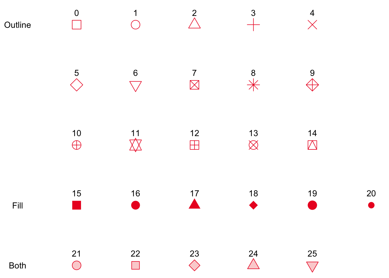
scale_color_manual(values = c("setosa" = "purple","versicolor" = "red"))Set shapes by factor:
scale_shape_manual(values = c("setosa" = 1, "versicolor" = 2))

Add annotation:
annotate("text", x = 100, y =200, label = "WORD", color = "blue", fontface=2, size = 6.4)Add Arrows:
annotate( geom = "curve", x = 100, y = 200, xend = 200, yend = 300, curvature = .45, arrow = arrow(length = unit(2, "mm")))
Statistics
Linear model: Relationship between infant_mortality (x) and life_expectancy (y) from gapminder dataset:
lm(infant_mortality\~life_expectancy, data = gapminder)-
bo2 %>% ggplot(aes(x = lag, y = copies_mL)) + geom_point() + stat_smooth(method = "lm")+ stat_correlation(method = "pearson")+ labs(title = "LM DustxCopies (BO+1)", x = "log(dust)")
Exporting
Save as RDS file in specific folder:
saveRDS(data, file = "Desktop/cheese/newdata.rds")would save the file newdata.rds in a folder called cheese on the desktop
readRDS("Desktop/cheese/newdata.rds")would load it back inSave plot as png:
png(file = "file/location/plot.png")
Gpplot code
dev.off()
Random
- Make a nice table:
table<- data.frame(Height, Width)
kable(table)