library(dslabs)
library(tidyverse)
library(renv)R Coding Exercise: Processing, Plotting, and Fitting Models
Note: To make for a cleaner look, I used {r, message/results/echo/warning = FALSE} to hide the output.
Load Libraries
Working with Gapminder Data
Examine Structure
help(gapminder) #Pulls up help page for gapminder data
str(gapminder) #Overview of data structure
summary(gapminder) #Summary of data
class(gapminder) #Determine type of object gap minder is (data frame)
as_tibble(gapminder) #Displays dataframe as a readable tibble
Condense dataset to African Countries
africadata <- gapminder %>%
  filter(continent %in% "Africa")

str(africadata) #Overview of africadata structure
summary(africadata) #Summary of #africadata. This is good for seeing NAs in data
Create two new objects: Infant Mortality (im) and Population (pop)
im <-
  africadata %>%
  select(infant_mortality, life_expectancy)

pop <-
  africadata %>%
  select(population, life_expectancy)

str(im)
summary(im)

str(pop)
summary(pop)
Plotting
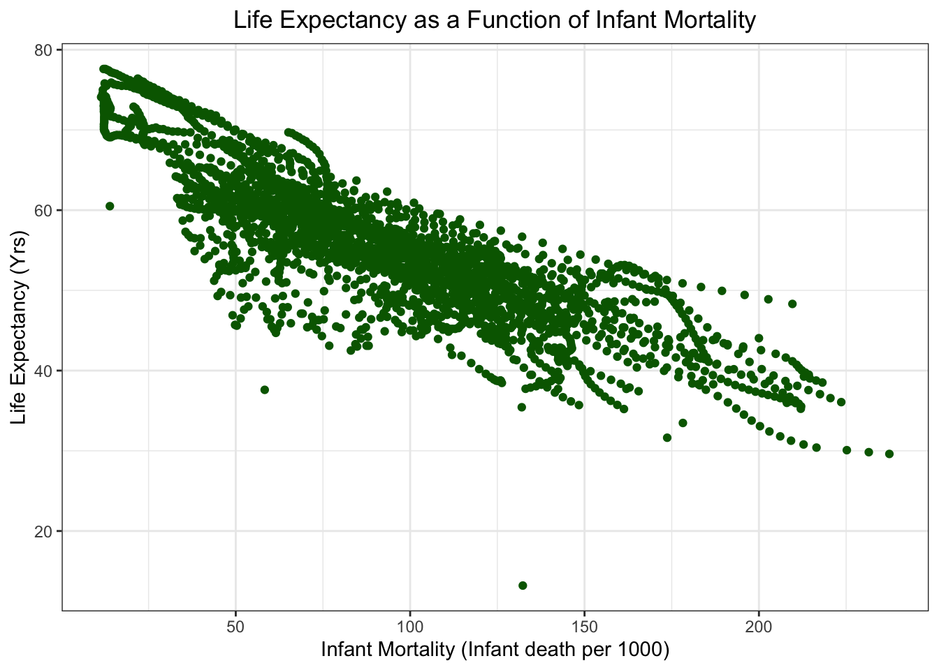
Life Expectancy as a function of Infant Mortality
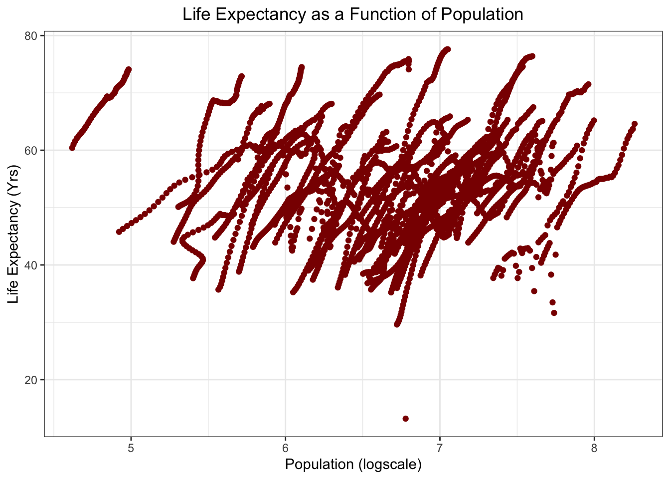
Life Expectancy as a function of Population
Condense dataset to the year 2000
Code for seeing which years have NAs for Infant Mortality
im_na<- africadata %>%
  filter(is.na(infant_mortality))
im_na
1960-1981 and 2016 have NAs
Create new object that looks at the year 2000
two_k<- africadata %>%
  filter(year %in% "2000")
str(two_k)
summary(two_k)
Make two new objects for the year 2000
im2<- two_k %>%
select(infant_mortality, life_expectancy)

pop2<- two_k %>%
  select(population, life_expectancy)
Plotting
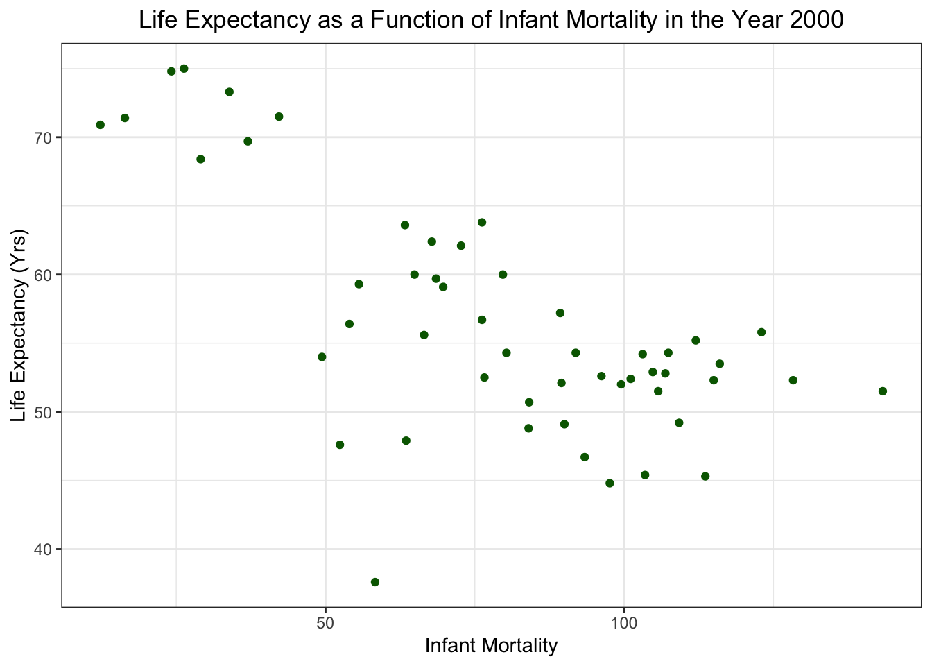
Life Expectancy as a funtion of Infant Mortality in 2000
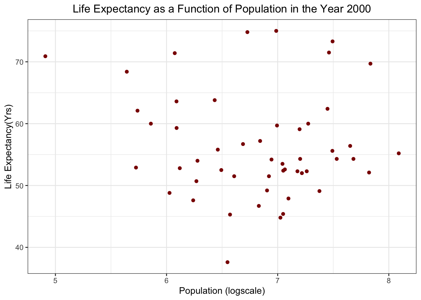
Life Expectancy as a funtion of Population in 2000
Linear Models
im2.fit <- lm(infant_mortality~life_expectancy, data=im2)

pop2.fit<- lm(population~life_expectancy, data= pop2)

summary(im2.fit)
Call:
lm(formula = infant_mortality ~ life_expectancy, data = im2)

Residuals:
    Min      1Q  Median      3Q     Max
-67.262  -9.806  -1.891  12.460  52.285

Coefficients:
                Estimate Std. Error t value Pr(>|t|)
(Intercept)     219.0135    21.4781  10.197 1.05e-13 ***
life_expectancy  -2.4854     0.3769  -6.594 2.83e-08 ***
---
Signif. codes:  0 '***' 0.001 '**' 0.01 '*' 0.05 '.' 0.1 ' ' 1

Residual standard error: 22.55 on 49 degrees of freedom
Multiple R-squared:  0.4701,    Adjusted R-squared:  0.4593
F-statistic: 43.48 on 1 and 49 DF, p-value: 2.826e-08summary(pop2.fit)
Call:
lm(formula = population ~ life_expectancy, data = pop2)

Residuals:
      Min        1Q    Median        3Q       Max
-18308728 -12957963  -6425955   2079794 107435285

Coefficients:
                Estimate Std. Error t value Pr(>|t|)
(Intercept)      5074933   21193712   0.239    0.812
life_expectancy   187799     371938   0.505    0.616

Residual standard error: 22250000 on 49 degrees of freedom
Multiple R-squared:  0.005176,  Adjusted R-squared:  -0.01513
F-statistic: 0.2549 on 1 and 49 DF,  p-value: 0.6159
Based on p-values, it looks like there is a significant relationship between infant mortality and life expectancy in the year 2000(p-value = 2.83e-8). There does not seem to be a significant correlation between population and life expectancy (p-value = 0.62)
This section was added by Kimberly Perez
library(broom)Region and Fertility
# Code to create a box plot to visualize fertility by region
bp_fert<-ggplot(two_k, aes(x=region, y=fertility, color= region)) + geom_boxplot(outlier.color="seagreen3", outlier.shape=8, outlier.size=2)

# Editing the size and shapes present on the boxplot and adding title/axis labels
bp_fert + stat_summary(fun=mean, geom="point", shape=13, size=4) + labs(x="Region", y= "Fertility (Number of children)", color="Region Legend", title="Fertility by Region in Africa for 2000")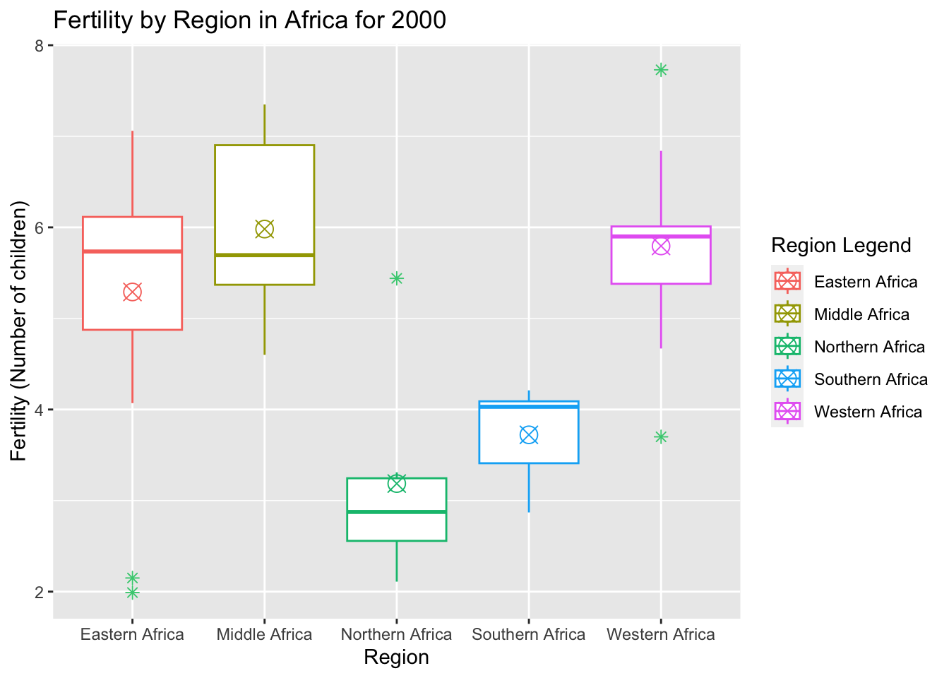
Filtering Dataset for NAs (fertility and GDP) and condensing data to year 2000
fert_na<- africadata %>%
  filter(is.na(fertility))
fert_na
unique(fert_na$year)

gdp_na<- africadata %>%
  filter(is.na(gdp))
gdp_na
unique(gdp_na$year)

fert_a<- africadata[which(africadata$year=="2000"),]

str(fert_a)
Fertility as a function of Gross Domestic Production (GDP) in 2000
fert_a %>%
  ggplot() +
  geom_point(
    aes(
      x= log10(gdp), #Log scale for Population
      y= fertility),
    color = "cadetblue") +
  theme_bw()+
  labs(
    x= "GDP (logscale)",
    y= "Fertility (Number of Children)",
    title= "Fertility as a Function of Gross Domestic Production (GDP) in 2000") +
  theme(plot.title = element_text(hjust = 0.5))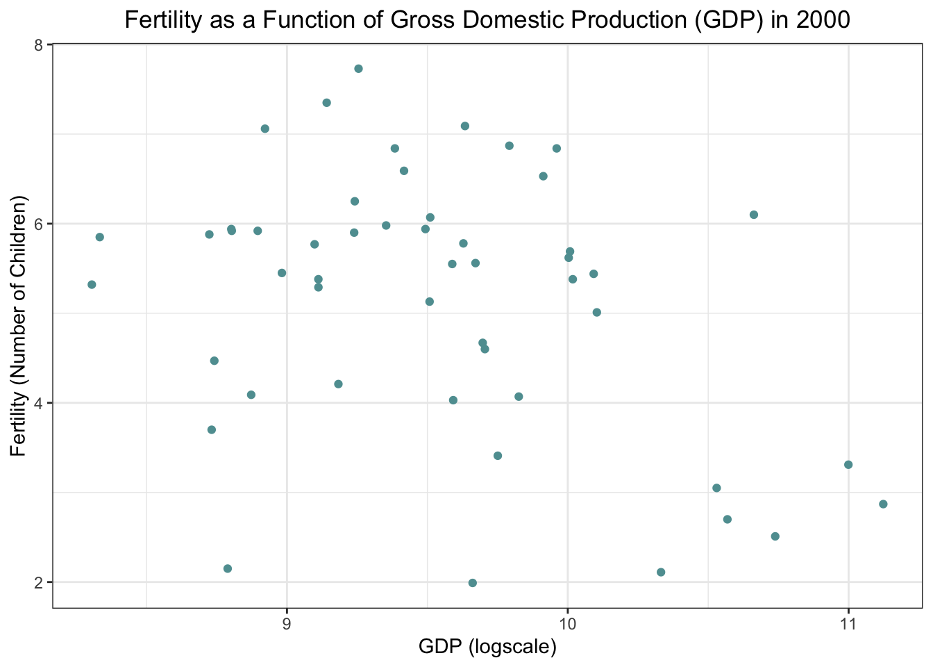
Fertility as a function of Gross Domestic Production (GDP)
ggplot(fert_a, aes(log10(gdp), fertility))+ geom_point() +
  geom_smooth(method="lm") +
  labs(title="Fertility as a function of Gross Domestic Production", x="Gross Domestic Product [GDP] (logscale)", y="Fertility (Number of children)")
`geom_smooth()` using formula = 'y ~ x'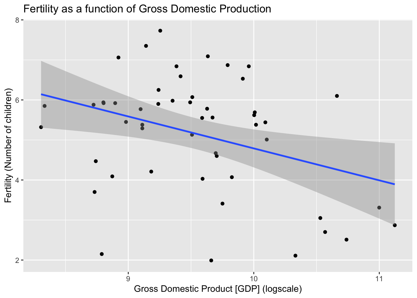
A Simple Fit and Table Using the Package Broom
le_fit<-lm(gdp~life_expectancy, data=two_k)
tidy(le_fit)
# A tibble: 2 × 5
term estimate std.error statistic p.value
<chr> <dbl> <dbl> <dbl> <dbl>
1 (Intercept) -43674026618. 22193180970. -1.97 0.0548
2 life_expectancy 979861038. 389477885. 2.52 0.0152Based on the p-values for the given fits, GDP as a predictor of LE is said to be statistically significant. But can we truly trust p-values?…