library(tidyverse)
library(here)
library(scales)
library(ggthemes) #To get plot themes
library(ggpubr)
library(patchwork) #To stack plots Visualization Exercise
Data Description
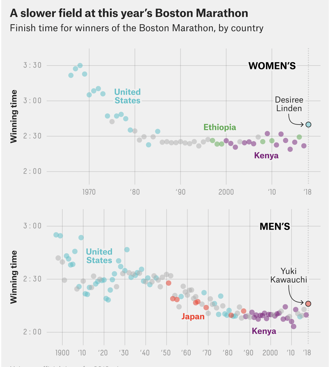
The plot that I am reproducing can be found on the fiverthirtyeight article “This year’s Boston Marathon was Slooooowww” from 2018. By graphing winning times from previous marathon’s by country, the plot shows that the winners (both men and women) had slower times in 2018 as compared to previous years. The dataset used can be found on the Boston Athletic Association website. The datasets (2) contain country, time, name, and year for both men and women respectively. Here is the original plot that I will be replicating:
Libraries
Load datasets for men and women times
men<- read_csv(here("data","men_times.csv")) #Men's race times
women<- read_csv(here("data", "women_times.csv")) #Women's race times
Data Altering
Let’s preview the data:
summary(men) year name country time
Min. :1897 Length:125 Length:125 Length:125
1st Qu.:1928 Class :character Class :character Class1:hms
Median :1959 Mode :character Mode :character Class2:difftime
Mean :1959 Mode :numeric
3rd Qu.:1990
Max. :2022 summary(women) year name country time
Min. :1966 Length:56 Length:56 Length:56
1st Qu.:1980 Class :character Class :character Class1:hms
Median :1994 Mode :character Mode :character Class2:difftime
Mean :1994 Mode :numeric
3rd Qu.:2007
Max. :2022 While we have winning times up to 2022, the graph was published in 2018, so we need to filter the dates up to that year. Here, I also created a new column that highlighted the primary countries for men and women. Using case_when(), if the country said: Japan (men), Ethiopia (women), United States, or Kenya, the new column repeated that name. Any other country was charactereized as NA in the new column.
Make new column that singles out the three main countries of interest for men and women
men2<- men %>%
  mutate(time2 = as.numeric(men$time)) %>% #Switched time from an interval (unknown) to numeric (seconds)
  mutate(country2 = case_when(country == "Kenya"~"Kenya",
                              country == "United States"~ "United States",
                              country == "Japan"~"Japan"))%>%
   filter(year %in% "1897":"2018")

women2<- women %>%
   mutate(time2 = as.numeric(women$time)) %>% #Switched time from an interval (unknown) to numeric (seconds)
  mutate(country2 = case_when(country == "Kenya"~"Kenya",
                              country == "United States"~ "United States",
                              country == "Ethiopia"~"Ethiopia")) %>%
  filter(year %in% "1966":"2018")

men_18<- men %>% #Single point of interest (2018)
  filter(year %in% 2018)

women_18<- women %>% #Single point of interest (2018)
  filter(year %in% 2018)
Let’s take a look at the result.
print(men2)# A tibble: 122 × 6
year name country time time2 country2
<dbl> <chr> <chr> <time> <dbl> <chr>
1 2018 "Yuki Kawauchi" Japan 02:15:58 8158 Japan
2 2017 "Geoffrey Kirui" Kenya 02:09:37 7777 Kenya
3 2016 "Lemi Berhanu" Ethiopia 02:12:45 7965 <NA>
4 2015 "Lelisa Desisa" Ethiopia 02:09:17 7757 <NA>
5 2014 "Mebrahtom \"Meb\" Keflezighi" United States 02:08:37 7717 United Sta…
6 2013 "Lelisa Desisa" Ethiopia 02:10:22 7822 <NA>
7 2012 "Wesley Korir" Kenya 02:12:40 7960 Kenya
8 2011 "Geoffrey Mutai" Kenya 02:03:02 7382 Kenya
9 2010 "Robert Kiprono Cheruiyot" Kenya 02:05:52 7552 Kenya
10 2009 "Deriba Merga" Ethiopia 02:08:42 7722 <NA>
# … with 112 more rowsprint(women2)# A tibble: 53 × 6
year name country time time2 country2
<dbl> <chr> <chr> <time> <dbl> <chr>
1 2018 Desiree Linden United States 02:39:54 9594 United States
2 2017 Edna Kiplagat Kenya 02:21:52 8512 Kenya
3 2016 Atsede Baysa Ethiopia 02:29:19 8959 Ethiopia
4 2015 Caroline Rotich Kenya 02:24:55 8695 Kenya
5 2014 Buzunesh Deba Ethiopia 02:19:59 8399 Ethiopia
6 2013 Rita Jeptoo Kenya 02:26:25 8785 Kenya
7 2012 Sharon Cherop Kenya 02:31:50 9110 Kenya
8 2011 Caroline Kilel Kenya 02:22:36 8556 Kenya
9 2010 Teyba Erkesso Ethiopia 02:26:11 8771 Ethiopia
10 2009 Salina Kosgei Kenya 02:32:16 9136 Kenya
# … with 43 more rowsCreate lists for x axis
The figure displays the x axis in years as both 4 digits and 2 digits with a “`”. Here I manually create lists that will be used as axis labels downstream.
men_years<- c("1900", "'10", "'20", "'30", "'40", "'50", "'60", "'70", "'80", "'90", "2000", "'10", "'18")
women_years <- c("1970","'80", "'90", "2000", "'10", "`18" )
Plotting
Plot Women
#Basic plotting
wom<- women2 %>% ggplot() +geom_point(
  aes(x= year,
      y = time,
      color= country2),
  alpha =0.5,
  size = 3)+
theme_fivethirtyeight()+ #Theme is specific to their website

#Working with axis scales
  scale_x_continuous(breaks = c(1970,1980, 1990, 2000,2010,2018), #Breaks will go from 1970-2018 by 10 years
                     limits = c(1966,2018), #Limits set from 1966-2018
                     labels = women_years) + #Here is that manual list for the x axis labels
  scale_y_time(breaks = date_breaks("30 mins"),
               limits = c("7200", "12960"))+ #times are in seconds
  geom_vline(xintercept = 2018,alpha=0.3, #Adds dashed line to 2018
             linetype = "dotted")+

#Add Labels/Arrows to Plot
  annotate("text", x = 2013, y =12555, label = "WOMEN'S", color = "#36454F", fontface=2, size = 6.4)+
  annotate("text", x = 2009, y =8300, label = "Kenya", color = "#800080", fontface =2) +
  annotate("text", x = 1979, y =11000, label = "United\nStates", color = "#6495ED", fontface = 2)+
  annotate("text", x = 2000, y =9100, label = "Ethiopia", color = "#228B22", fontface = 2)+
  annotate("text", x = 2015, y =10600, label = "Desiree\nLinden")+
  annotate( geom = "curve", x = 2015, y = 10100, xend = 2017.3, yend = 9600,
  curvature = .45, arrow = arrow(length = unit(2, "mm")))+

#Assign Colors by Country. Hex codes were Googled.
  scale_color_manual(values = c("Ethiopia" = "#228B22",
                                "United States" = "#6495ED",
                                "Kenya" = "#800080"))+

#Labels
  labs(y = "Winning time",
      title = "A slower field at this year's Boston Marathon",
      subtitle = "Finish time for winners of the Boston Marathon, by country")+#,
     # caption ="'18")+ #This was the only way I could think of adding 2018 the axis that had breaks of 10 years otherwise.


#Work with Plot colors, fonts, and Label Positions
  theme(legend.position = "none",
        panel.background = element_rect("#E5E4E2"),
        plot.background = element_rect("#E5E4E2"),
        plot.title = element_text(color = "black",
                                   hjust = -1.4),
        plot.subtitle = element_text(hjust = -.41),
        axis.title.y = element_text(color = "#36454F",
                                     face= "bold")) +
       # plot.caption = element_text(hjust = 0.96555, vjust = 8.1)) +

#Create new plot to overlay with point of interest (2018)
  geom_point(data=women_18,
           aes(x = year, y= time),
           pch = 21, color ="black", #Outline point
           size = 3,
            alpha = 0.8)

wom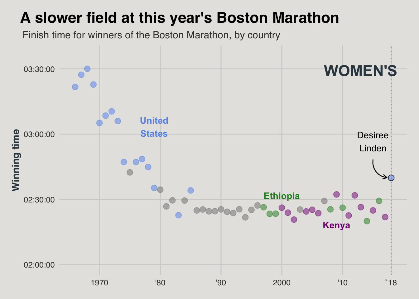
Plot Men
#Basic Plotting
mn<- men2 %>% ggplot() +geom_point(
  aes(x= year,
      y = time,
      color= country2),
  alpha = 0.5,
  size = 3)+
theme_fivethirtyeight()+

#Working with axis scales
  scale_x_continuous(breaks = c(1900,1910,1920,1930,1940,1950,1960,1970,1980,1990,2000,2010,2018), #Breaks go from 1900-2018 by 10 years
                     limits = c(1897,2020), #Limits set from 1897-2020
                    labels = men_years) + #Using list from above for x axis labels
  scale_y_time(breaks = date_breaks("30 mins"),
               limits = c("7200", "10800"))+ #Time in seconds
  geom_vline(xintercept = 2018,
             alpha=0.3,
             linetype = "dotted") +

#Add Labels/Arrows to Plot
  annotate("text", x = 2011, y =10500, label = "MEN'S", color = "#36454F", fontface=2, size = 6.4)+
  annotate("text", x = 2000, y =7500, label = "Kenya", color = "#800080", fontface=2) +
  annotate("text", x = 1919, y =9500, label = "United\nStates", color = "#6495ED", fontface=2)+
  annotate("text", x = 1960, y =7900, label = "Japan", color = "red", fontface =2)+
  annotate("text", x = 2010, y =9000, label = "Yuki\nKawauchi")+
  annotate( geom = "curve", x = 2010, y = 8750, xend = 2016.5, yend = 8150,
    curvature = .45, arrow = arrow(length = unit(2, "mm")))+

#Working with Labels, etc
   labs(y = "Winning time")+
       #caption  = "'18")+
  theme(legend.position = "none",
        panel.background = element_rect("#E5E4E2"),
        plot.background = element_rect("#E5E4E2"),
       axis.title.y = element_text(color = "#36454F",
                                   face = "bold"))+
      # plot.caption = element_text(hjust = 0.952, vjust = 8.1)) +

#Assign Colors by Country
  scale_color_manual(values = c("Japan" = "red",
                                "United States" = "#6495ED",
                                "Kenya" = "#800080"))+


#Overlay Plot with point of interest (2018)
  geom_point(data=men_18,
             aes(x = year, y= time),
             pch = 21, color ="black",
             alpha = 0.8,
             size = 3)

mn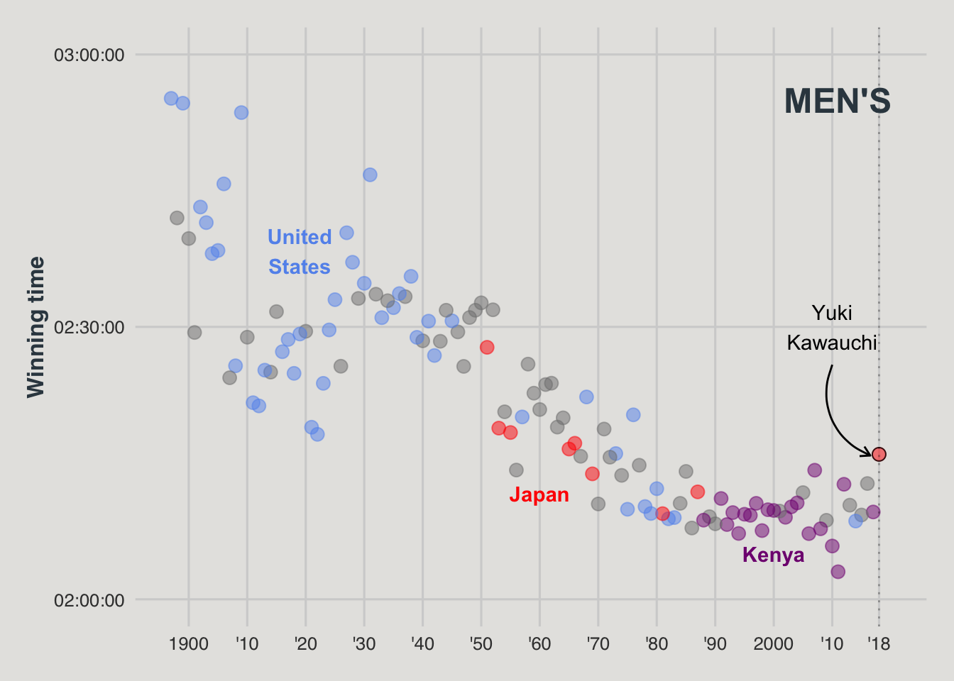
Final Plot
Here I used ggarrange() to stack the plots on top of one another.
figure<- ggarrange(wom, mn + font("x.text", size = 10),
                    ncol = 1, nrow = 2) #Final plot is 1 column and 2 rows


figure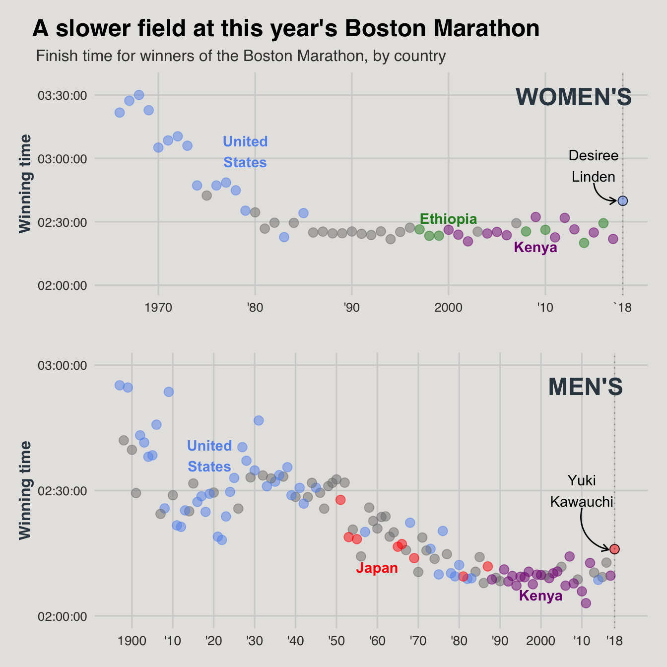
Pretty close! A few things that I struggled with were getting the y axis tick labels to be displayed as “2:00:00” as opposed to “02:00:00”. I also could not get the dashed lines for `18 to line up for both graphs without skewing everything else.
Save as PNG
png(file = here("results","plots", "marathon.png"))
figure
dev.off()
quartz_off_screen
2